Redesigning the Family Safety app and website
Summary
The Family Safety mobile app suffered from critical usability issues and no clear path to guide users to an ideal state. App rating stood at ~2.5. Together, I collaborated with the usability team which was 2 designers and 1 PM to create a more engaging app infrastructure. Users didn’t understand how to connect a device to a product.
I designed the content for all scenarios involving device connection and onboarding.
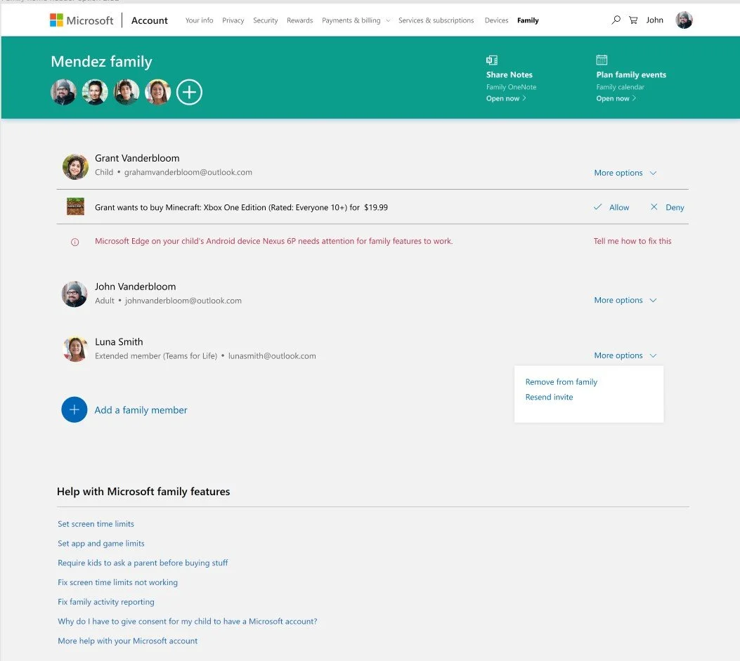
Additionally, the Family Safety website was unusuable and outdated
Facts
Microsoft Family Safety currently has ~15 million monthly active users
Works on Windows, Xbox, iOS, and Android
I am the only content designer on Microsoft Family Safety (1:25 Content Designer to UX Designer Ratio)
Results
Increased app store product rating from 2.6 to ~3.5 utilizing content design strategies.
Accelerated engagement within the app through writing new instructional modules, UI, and feature content to enhance user knowledge and engagement past onboarding.
Received positive customer feedback about changes made to the website UX.
Launched new support hub to create instructional content that matched the new UI.
The top 8 most viewed support articles hold around 4 million page views in total over 1 year.
Before
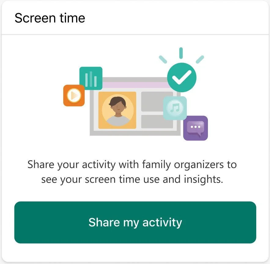
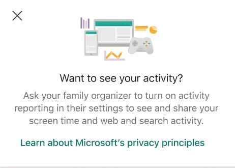
Family Safety app
“Everything is looking good” A constant message that’s not an accurate depiction of the state of devices.
Lack of features that didn’t have parity with the website.
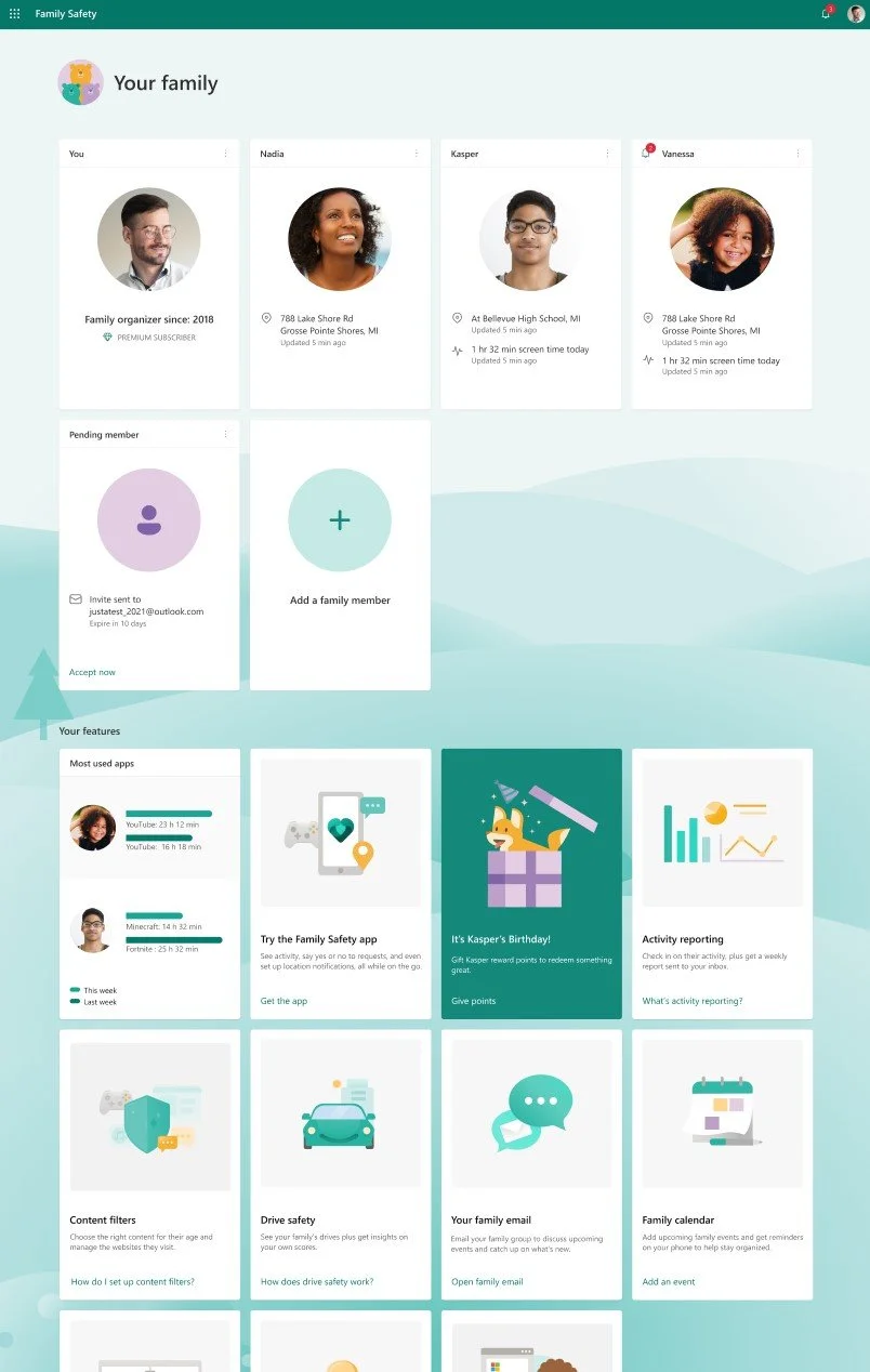
Family Safety website
Flat, lack of a dynamic family feel
Lack of clear ideal path
After
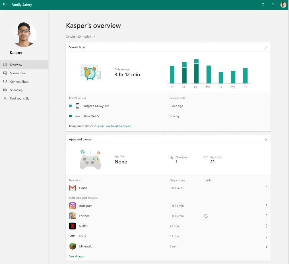
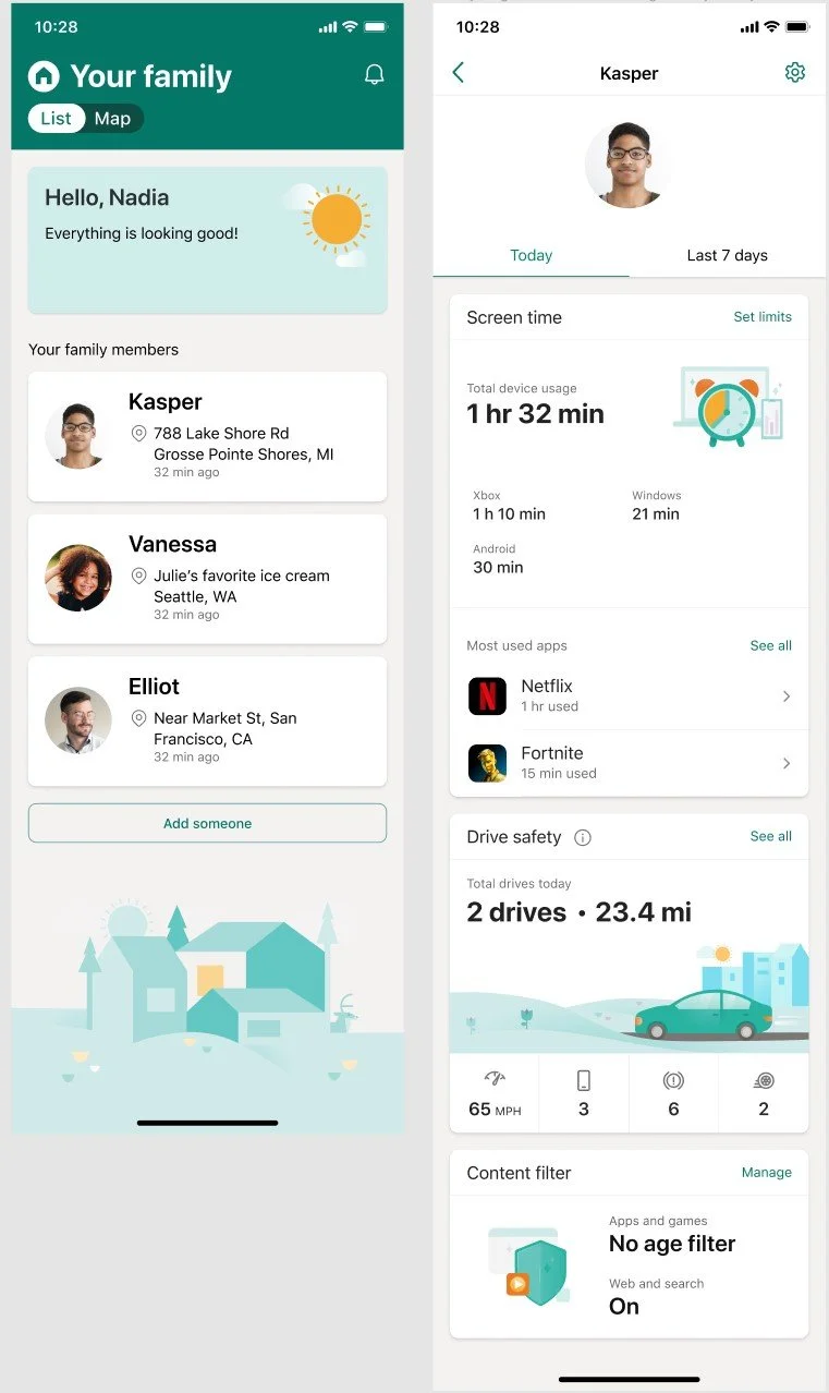
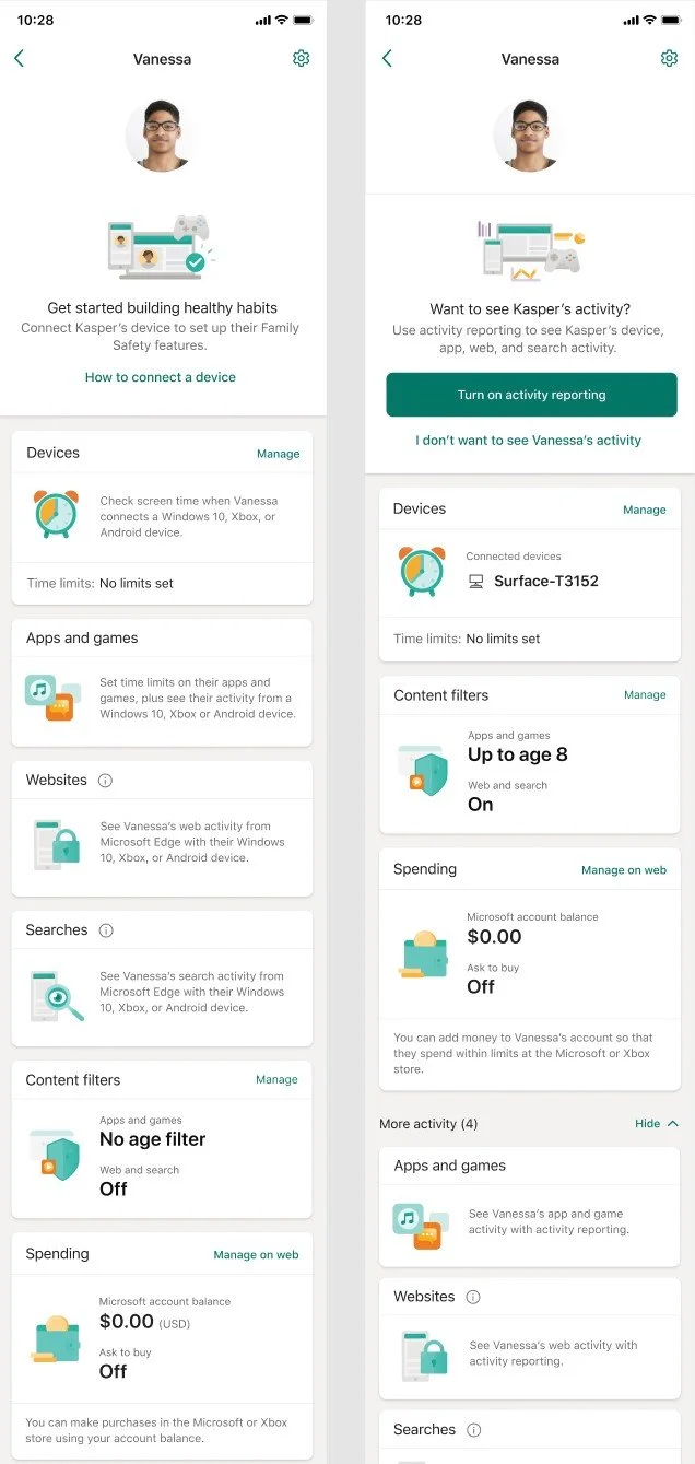
Family Safety app:
Actionable cold state text that allows the user to get
Lack of features that didn’t have parity with the website.
Family Safety website:
Added digital activity and physical safety states
Connected the Microsoft Family ecosystem by implementing feature awareness across email, OneNote etc.